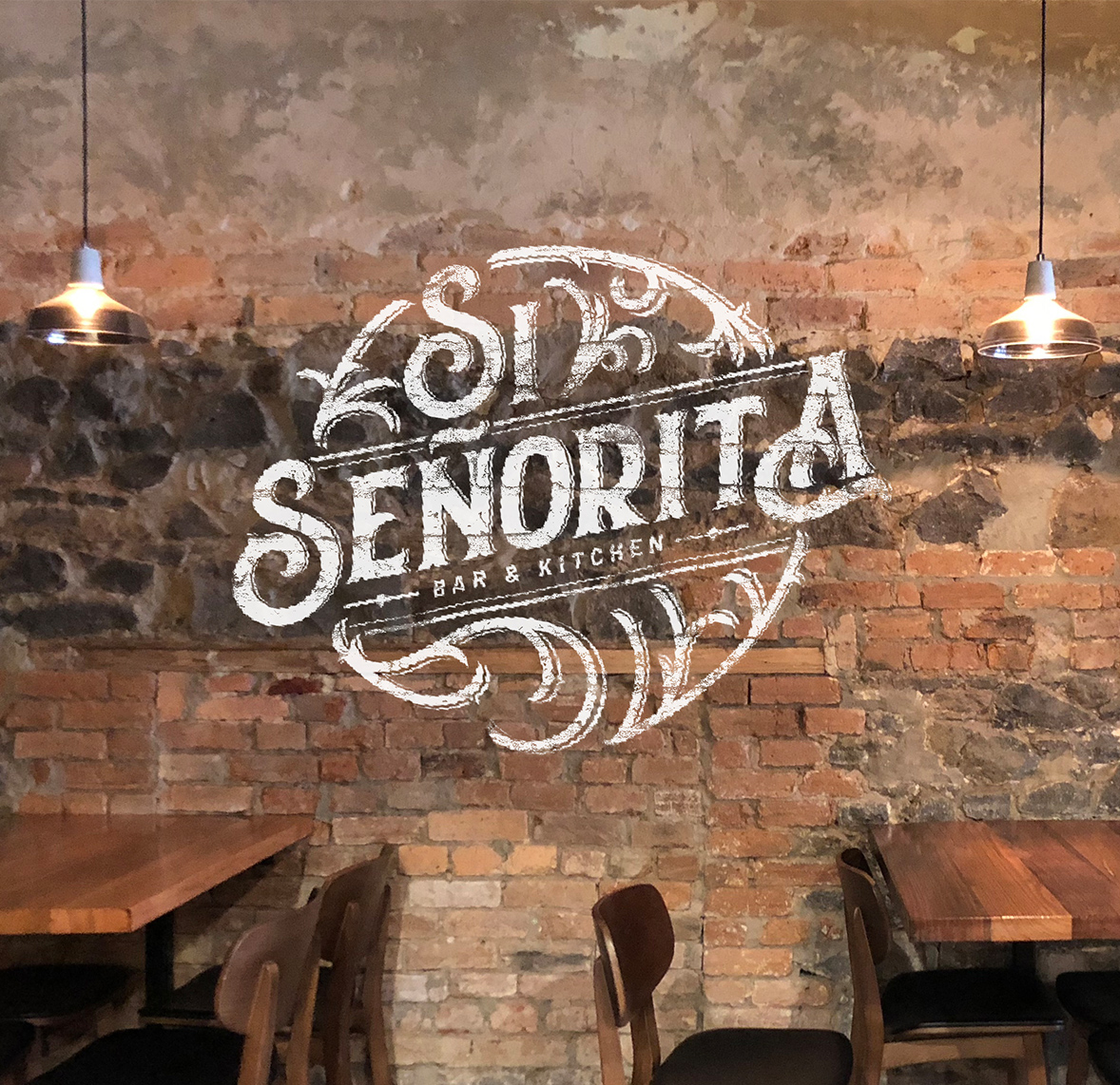
Si Señorita
Bar & Kitchen
Logo Design & Brand Strategy
It’s getting hot here with Si Señorita. The client had a great concept: a bar and restaurant, where locals and foodies can have some fun during lunch or after work. We had a crucial mission here: bring the brand to life.
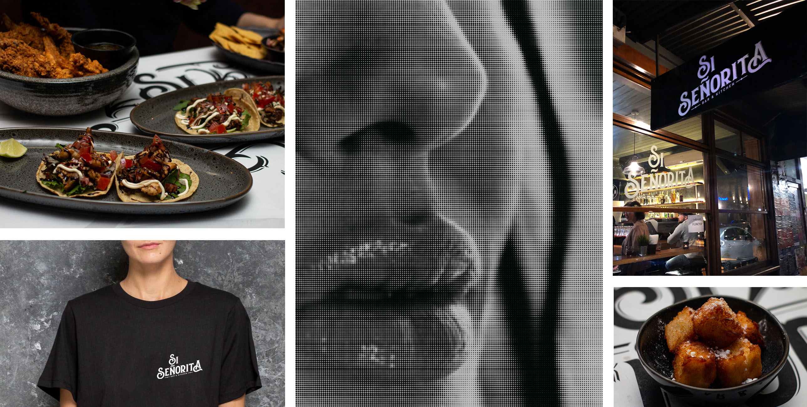
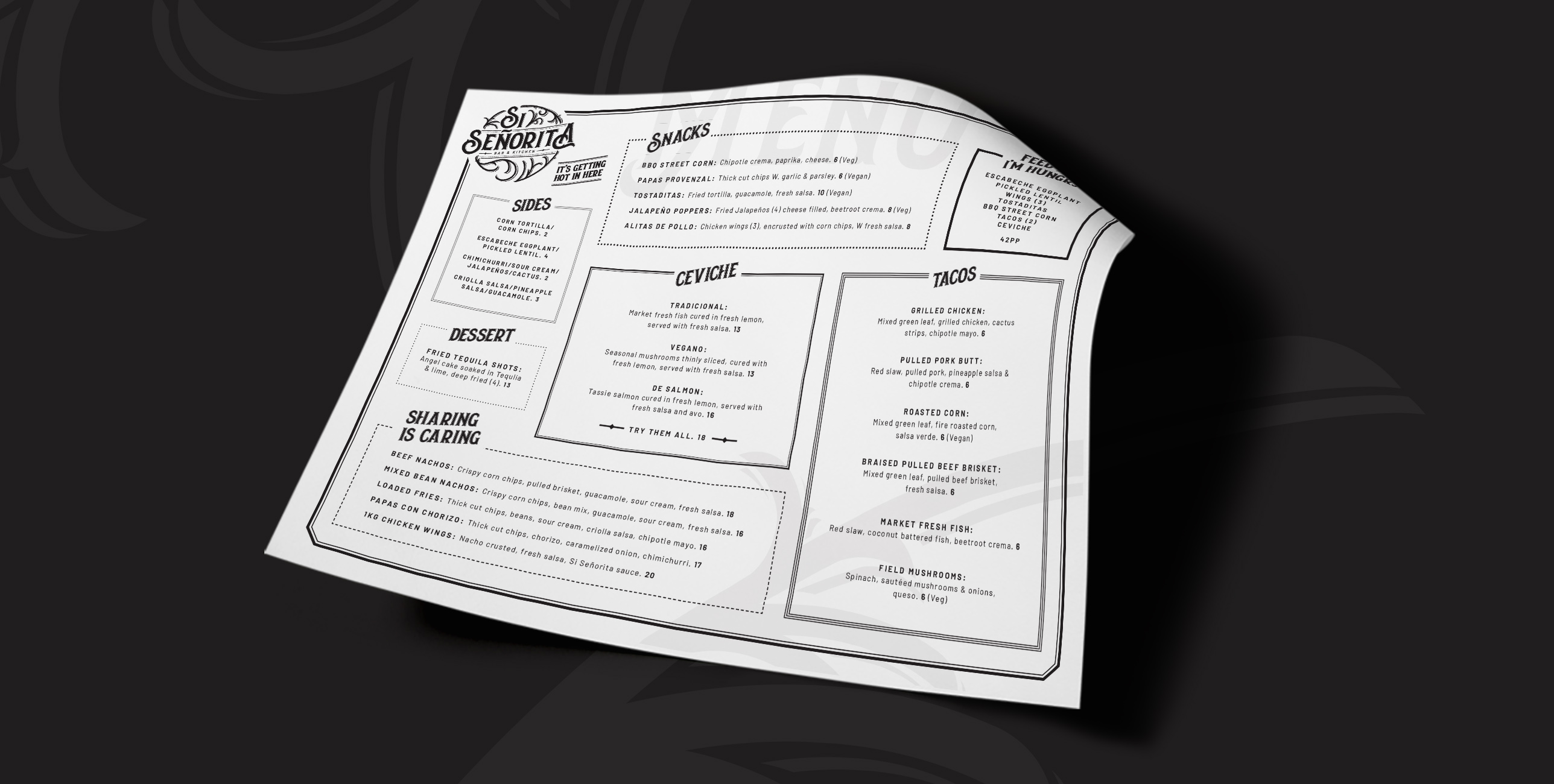
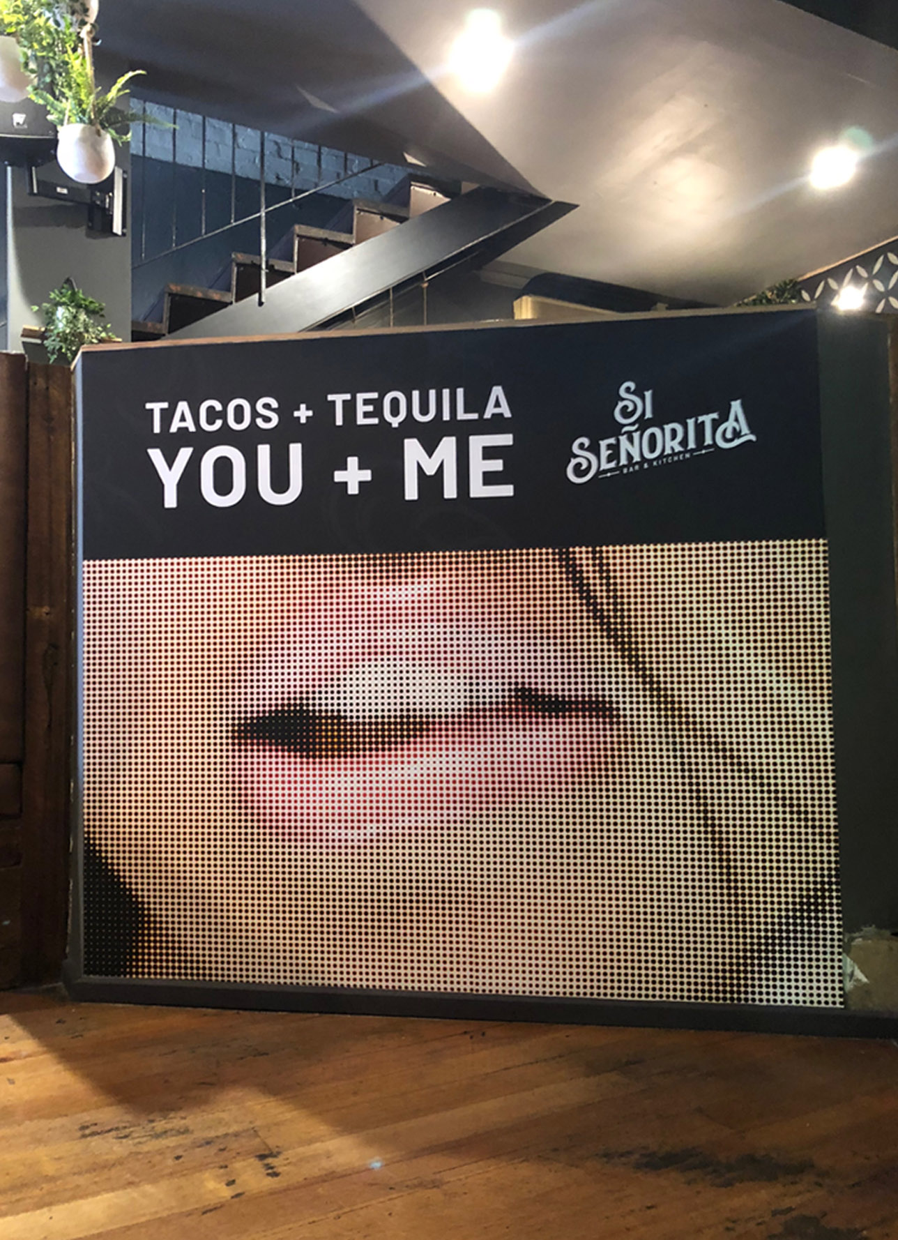
Si Señorita is an irresistible place, so we wanted to bring some brand elements into the place with some full scale paste up placed in the front and back.
When building the Brand ID, we took into account the fact that they’re more than tacos and tequila, they want to bring Latin American flavours to the menu and they want to do it with style. The final result is a mixture of traditional, classy and stylish elements (font, shapes, colours).
We also designed a simplified version of the logo so it looks good and tasty in different formats.
